カルチャー
Do you know of Susan Kare?
2021年6月19日
Text by Kosuke Ide
Artwork designed by Susan Kare, kareprints.com
Translation by Aya Muto
Edit by Yu Kokubu
Los Altos, California – From 1976 to the 1980s, when Steve Jobs and his cohort founded Apple, that was nothing but ‘the mythical era’ looking back today. Susan Kare is one of the legendary ‘gods’ of this time. In the early 1980s, Kare was still in her 20s when she designed graphics forthe first generation of the MacintoshGUI (Graphical User Interface).
Designed by Kare, and used continuously on Mac interface, were her icons such as “happy Mac,” “bomb,” ”trash can” and ”printer,” which you may well remember. Her brilliant ideas are definitely inherited in today’s icons.

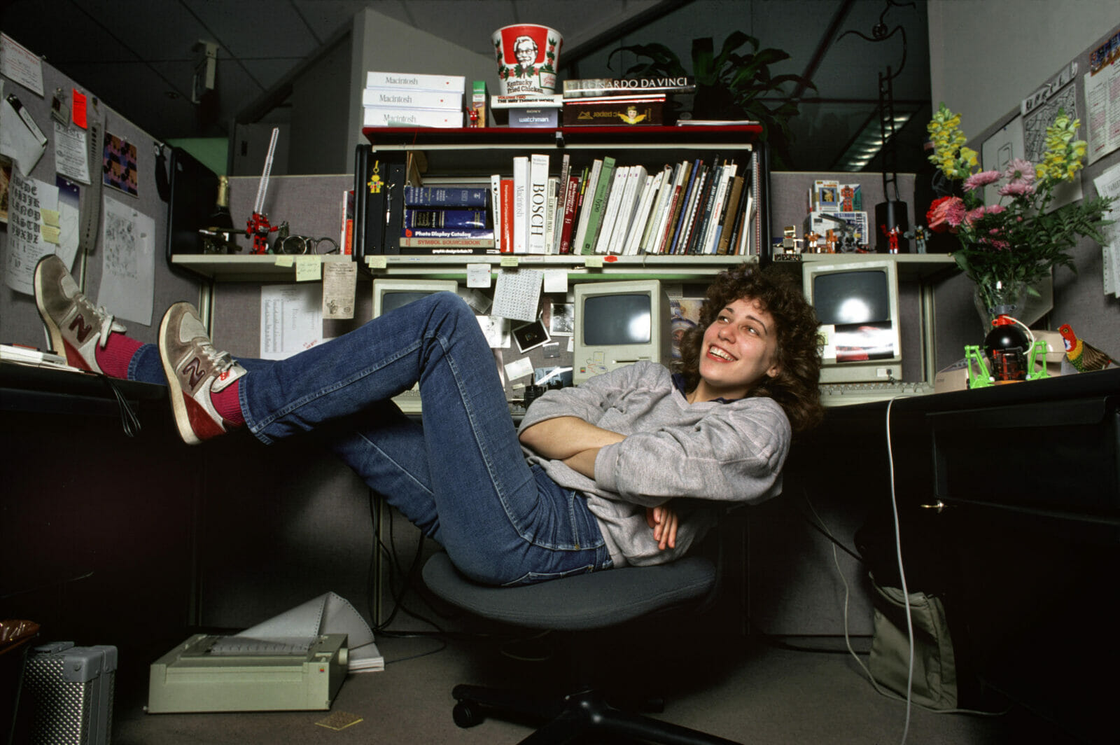
It all started with a phone call at a time when she was working in a museum in San Francisco after obtaining a PhD in Fine Arts from New York University in 1978. On the other end of the line was her high school friend from the Philadelphia suburbs, Andy Hertzfeld,who was a programmer. He was working as a software architect at Apple then. “Apple is looking for typeface and icon designer for our work-in-progress ‘Macintosh’ personal computer. Would you be interested?”
With this invitation, Kare joined Apple in 1982. Interestingly, at this point, Kare did not have any previous computer knowledge nor experience in digital typography.
By joining Apple, Kare was responsible for overall interface graphic design, including icons, buttons, title bars, fonts and other similar images. This was the early dawn of the PC (personal computer/computing), and the computer was still a complicated system developed for scientists and technicians’ use, and far from being ‘user friendly.’ All the commands to the computer were typed in via glowing green text on a black screen, but Jobs was certain that the future rested in the GUI system that he saw at PARC (a Xerox Palo Alto Lab) using the mouse and windows.
Jobs aimed for Mac’s user interface to be “usable by your mom” and “usable without any manual, like an arcade video game.” For this, a system of graphics that enabled intuitive operation needed to be developed. While Kare was not educated aboutcomputer graphics, she had experience in type design and was able to rely on books such as “Typography” by Emil Ruder, and she got started on designing the fonts and icons.
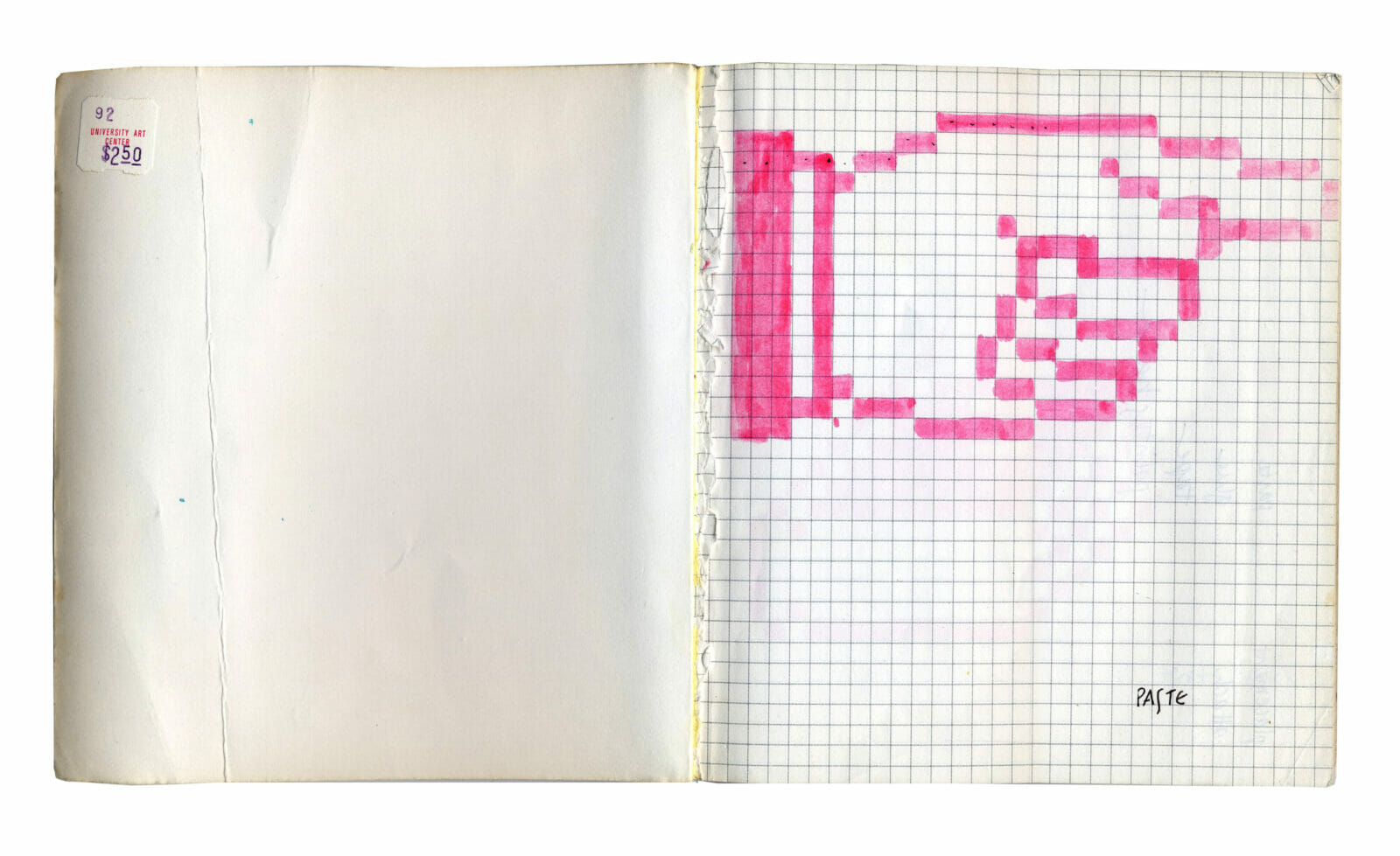
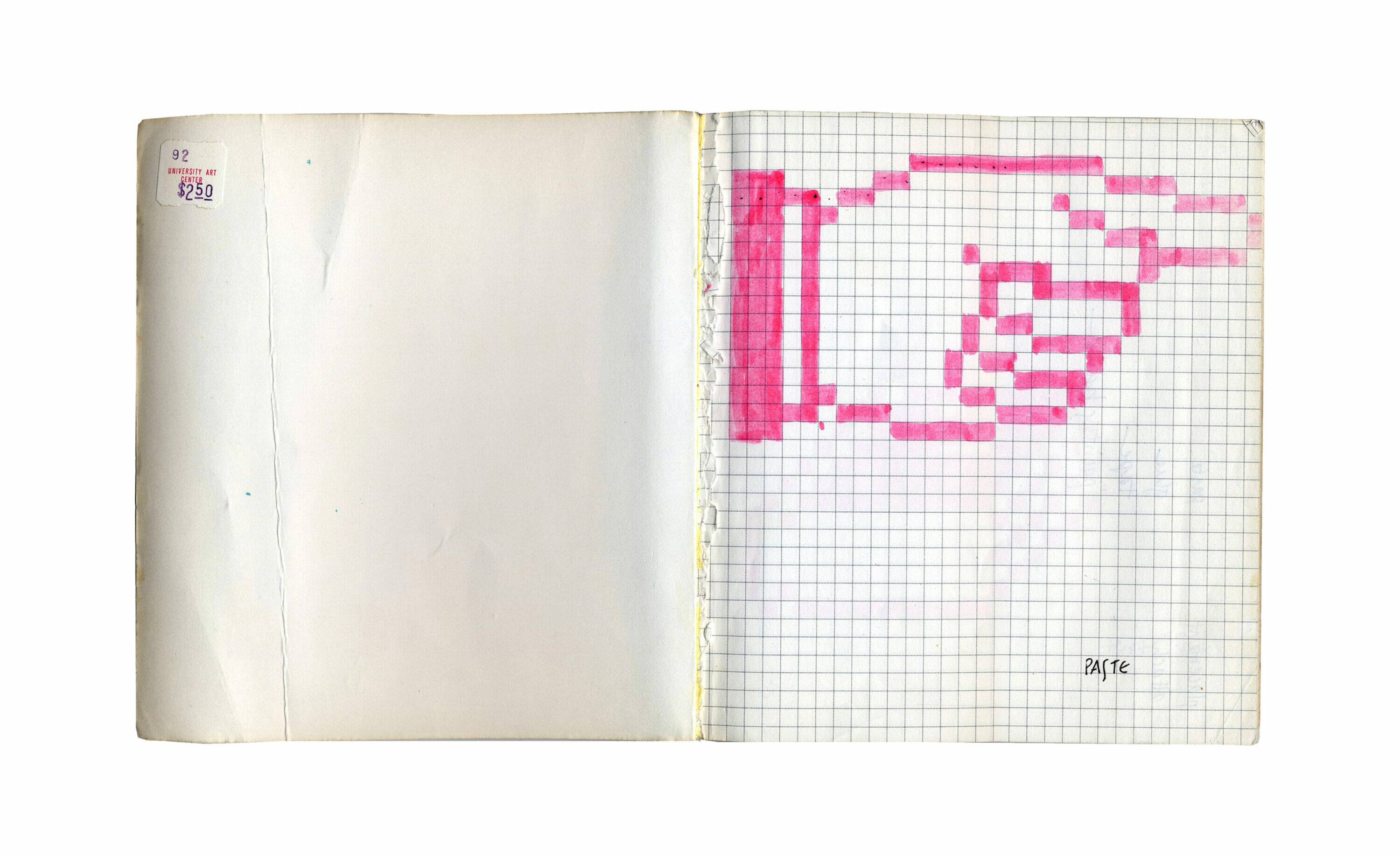
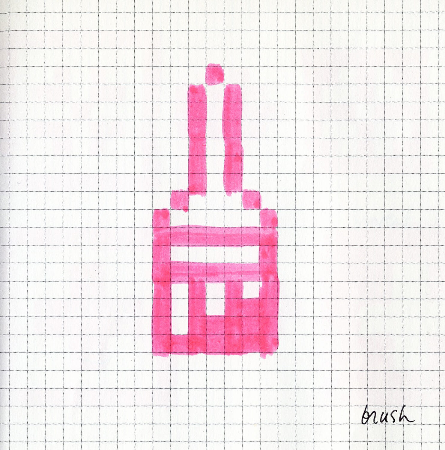
Back then the monitor was using a pixel (dot of light) bitmap matrix method to display data, and the screen was 72 dots per inch — extremely low in resolution compared to the standards today. Kare started originally with a small grid notebook, and sketched 32 x 32 pixel icons by coloring in the squares on the paper — images that were created for her interview at Apple.
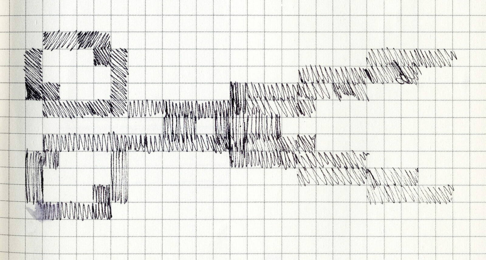
Having a mother that loved crafts like embroidery and knitting, this abstract, grid-baseddesign was a familiar method for Kare. Channeling her experience with needlepoint embroidery, Kare created various designs in the squares of the grid. Pencil, scissors, microphone, boots…she aimed to create simple, understandable, and friendly graphics. However, to develop symbolic forms that can be universally comprehended with limited screen real estate was not an easy feat; a 32 x 32 square icon is only 1024 pixels.
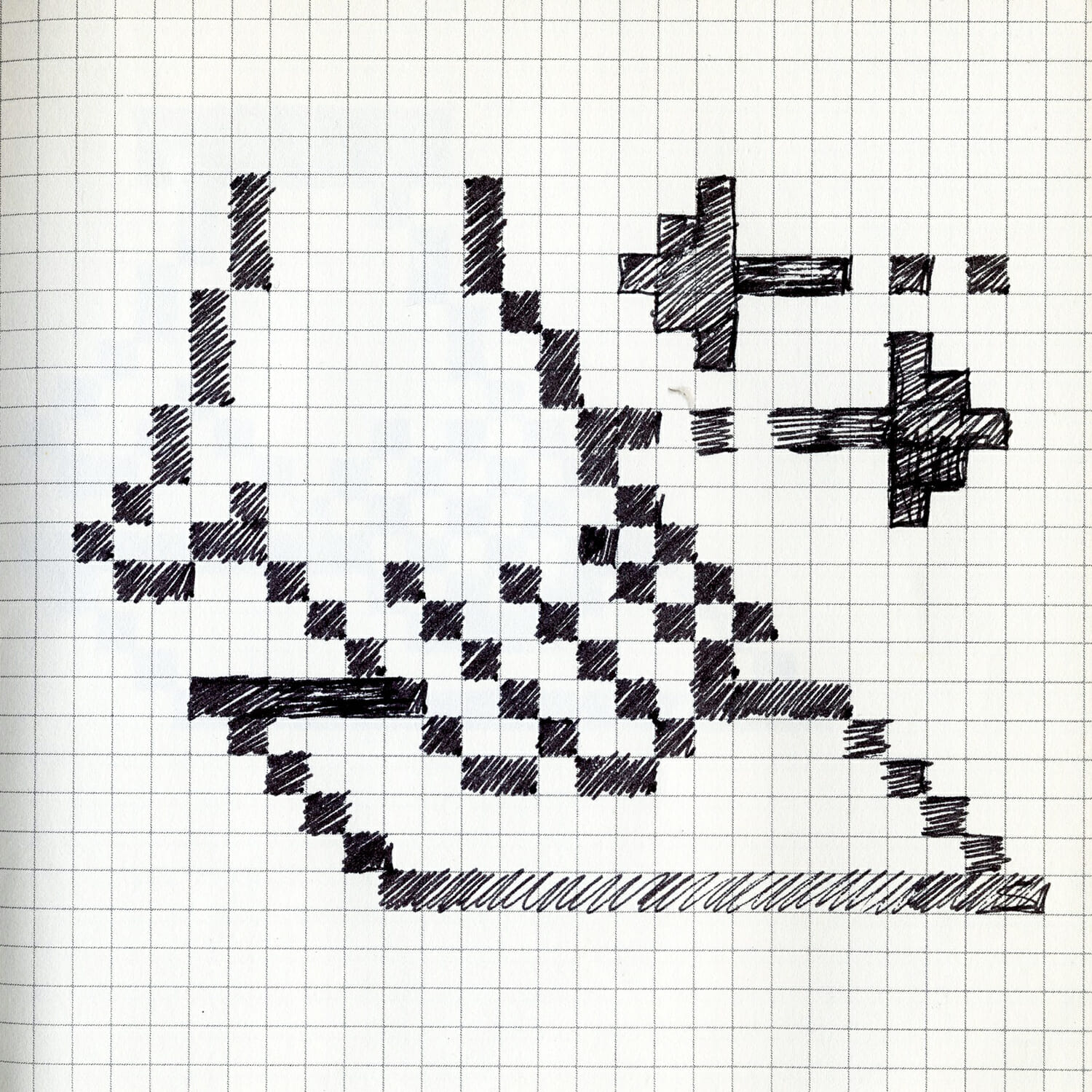
What helped Kare’s icon design was when her old friend Andy Hertzfeld wrote an “Icon Editor” program. This enabled one to design graphics directly on the Macintosh screen, with the ability to iterate — erase and repeat as desired. It was revolutionary back then to be able to design on the computer itself. Kare drew many practice sketches, and by weaving in concept and idea, she gradually brought many icons into the world.

Until the OS Jaguar that was launched in 2002 (Mac OSX v10.2), “happy Mac” was always there for 18 years when you started the Mac computer. The “trash can” where unwanted files were dropped, the “bomb” that signaled a serious computer error. “Wristwatch” that indicated a necessary wait. Icons designed by Kare were minimal and understandable; while cool and charming, they became the very basis of the GUI that advanced since then.
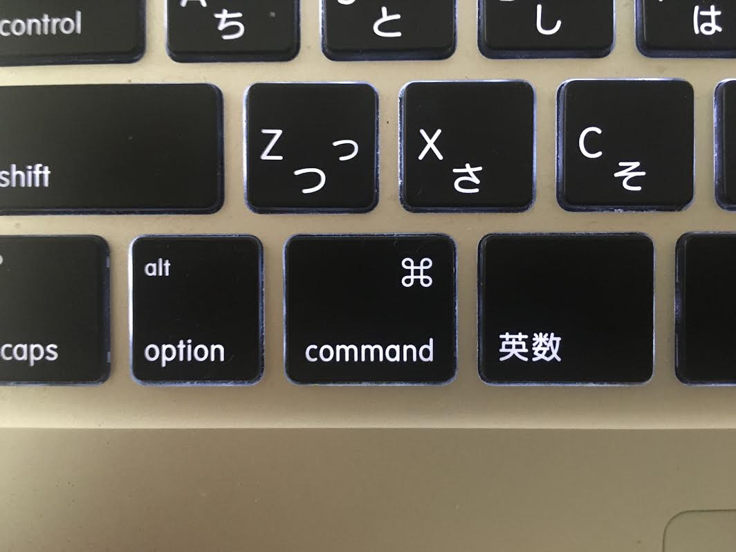
Many of the icons from that period have been retired, but the tool icons used in the first generation Mac’s included paint software, MacPaint by Bill Atkinson, are still used in today’s Photoshop, slightly edited. And what you still will see today is the command key icon ⌘ on the keyboards. Initially this command key had an Apple logo mark, but Jobs complained there were too many Apples (and that the logo should be used sparingly). Kare suggested an alternative icon, which was inspired by a Swedish camp ground sign, which she saw in a book of symbols.
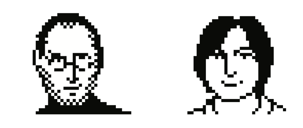
Her attractive graphics full of painterly aesthetics had many fans within Apple. As examples of how to design on the Macintosh, Kare created all kinds of documents, such as a financial report to team members, a birthday picnic invitation, and softball signup sheets. One famous example is Steve Jobs’ portrait, it is told. It became a status symbol to have a portrait done by Kare, and teammates lined up to get theirs done.
After designing many fonts and icons, Kare left Apple in 1986 to join Steve Jobs in his new venture, NeXT Computer, as the Creative Director. She was the tenth NeXT employee.
She founded her own design studio in 1988, and worked with clients such as Facebook, IBM, Microsoft, PayPal, and many others. Kare worked in Product Design at Pinterest from 2015-2021, and is currently a Design Architect at Niantic Labs, well known for Pokémon GO. Her contribution to the design world is still in the making.

ピックアップ
PROMOTION
〈KENZO〉のはじまりの地で、NIGO®が叶えたワードローブ。
KENZO
2026年7月8日

PROMOTION
日常に溶け込む、5・5グラムの北欧デザイン。
LINDBERG
2026年6月9日
PROMOTION
3EYEとボートに乗る日。
Timberland
2026年6月9日
PROMOTION
襟のついた服を着るカジュアル。
BEAUTY&YOUTH
2026年6月18日
PROMOTION
実はこれも別注品。
BEAUTY&YOUTH
2026年6月18日

PROMOTION
カナダグースがなんだか変わったみたいだ。
Canada Goose
2026年6月11日
PROMOTION
車体のカスタムパーツをオリジナルで作るメーカー・ダムド。その道を極めんとしつつ、フェスも音楽レーベルもやってるの!?
DAMD
2026年6月9日
PROMOTION
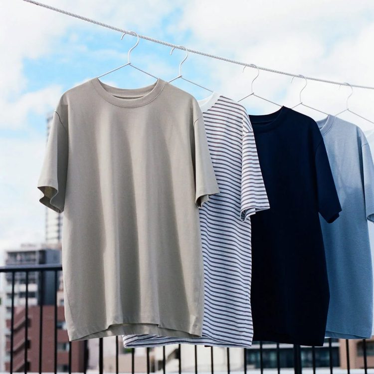
無地もボーダーも心地いい。〈無印良品〉のTシャツでこの夏も。
無印良品
2026年6月12日
PROMOTION
これまでの20年とこれからのこと。
BEAUTY&YOUTH
2026年6月18日
PROMOTION
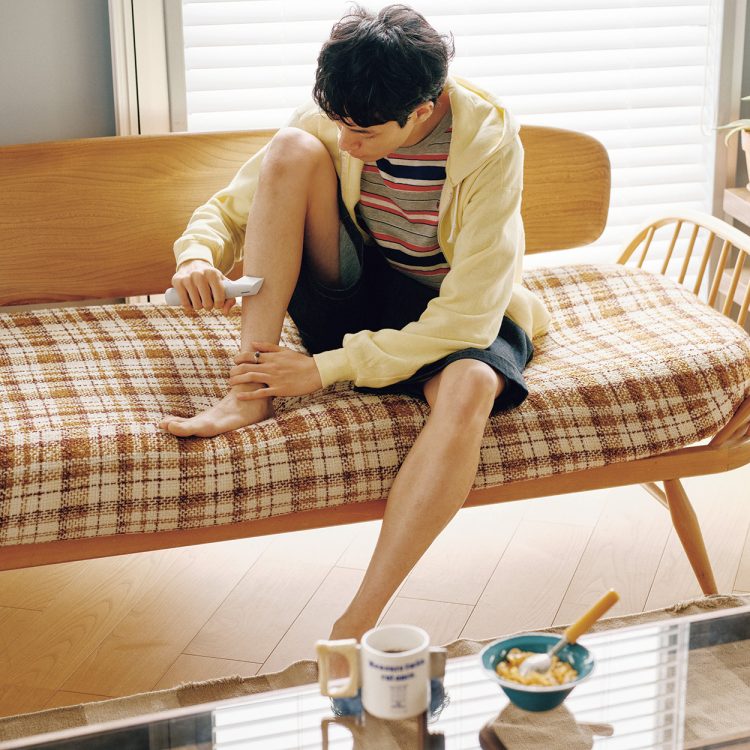
サマーボーイとグルーミング。
Panasonic
2026年7月9日